
Date: 8-DECEMBER-2021 Last Updated: 16-AUGUST-2026
Overview
Residual plots are commonly used in qualification and linearity studies to visually assess how closely measured responses align with expected values. In some cases, the default Excel™ graph settings may not automatically scale the vertical axis to match the magnitude of the residual values entered.
When this occurs, the plot can appear compressed or disproportionate, making it difficult to evaluate the data visually.
Fortunately, Excel™ provides tools that allow the user to quickly reset and rescale the Y-axis so the graph properly reflects the underlying data.
When Rescaling May Be Necessary
Manual rescaling may be useful when:
- Residual values are very small
- Data points appear compressed
- The graph does not display all points clearly
- The Y-axis limits do not reflect the actual data range
- Visual interpretation of detector linearity becomes difficult
Rescaling does not alter the qualification calculations. It only changes the graph display.
Accessing the Graph Formatting Options
Navigate to the worksheet containing the residual plot that requires adjustment.
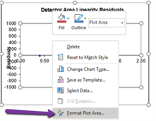
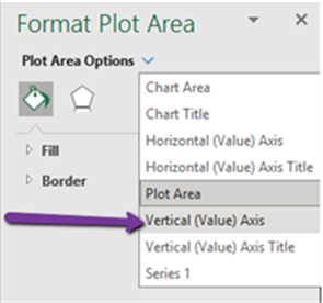
Select Format Plot Area
This opens the graph-formatting panel used to modify display settings.
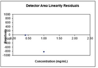
Opening Plot Area Options
Within the formatting panel:
- Locate Plot Area Options
- Expand the available options
- Select the graph configuration controls
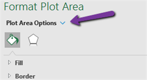
These controls provide access to the axis settings used to adjust graph scaling.
Selecting the Vertical Axis
After opening the graph options:
- Select Vertical (Value) Axis
- Open the associated Axis Options
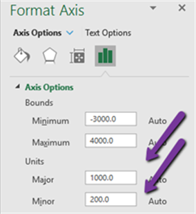
The Axis Options section contains the settings that control the minimum and maximum display ranges for the graph.
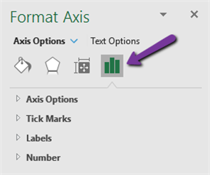
Resetting Axis Bounds
Within the Axis Options panel:
- Reset the Minimum Bound
- Reset the Maximum Bound
Allowing Excel™ to recalculate these values automatically often restores an appropriate display scale.
Resetting Major and Minor Units
After resetting the axis bounds:
- Reset the Major Unit
- Reset the Minor Unit
This allows Excel™ to automatically calculate interval spacing that matches the displayed data range.
Verifying the Updated Graph
After the axis and unit settings have been reset:
- The graph should automatically refresh.
- Data points should become easier to interpret.
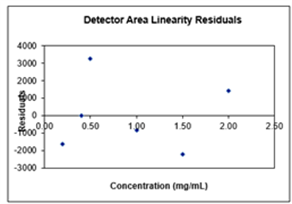
- The residual values should display using a scale that more accurately reflects the data entered.
The result is a more effective visual representation of detector linearity performance and qualification results.
Best Practices
When reviewing qualification graphs:
- Verify that all data points are displayed.
- Confirm that the Y-axis range is appropriate for the residual values.
- Avoid manually entering arbitrary axis limits unless specifically required.
- Maintain the original qualification calculations and formulas.
- Use graph rescaling only to improve visual interpretation.
Key Takeaways
- Residual plots may occasionally require manual Y-axis adjustment.
- Rescaling affects graph appearance only and does not alter qualification calculations.
- Resetting axis bounds allows Excel™ to recalculate an appropriate scale.
- Resetting major and minor units improves graph readability.
- Properly scaled residual plots provide a more accurate visual representation of detector linearity performance.
Additional Resources
For qualification standards, validated Excel™ templates, performance verification tools, and qualification documentation resources, view: HSQ™ and PQ™ Qualification Kits, Validation Tools, and Performance Verification Resources